Editor's Note: This post was originally published on January 14, 2014, and was most recently updated on November 12, 2019.
The topic of website conversion is one we have been talking about for a while now. But unless you live and breathe digital marketing (like we do), you may not fully understand it. So, if you are having difficulty understanding website conversion and things like landing pages and user experience, stick around because we're going to shed some light on an area of digital marketing that many businesses struggle with.
I'm going to tell you The Tale of Two Websites. The types of websites don't really matter, but for consistency's sake, let's say both websites sell boots of all shapes, sizes, and brands and are of the same technological quality. You might think that because these websites are built with the same technology and sell the same products, they'd be doing similarly well. However, one website does very well and the other very poorly. Why? Because one site has well-organized content, good site architecture, and uses landing pages, and the other does not. This results in a completely different user experience for website visitors, leading to vastly different conversion rates (ultimately, the number of shoes sold).
It Starts With User Experience
The difference between the two websites in question is apparent from the first second a visitor arrives on the homepages (let's assume the visitor found the homepage for both sites by searching Google with the term "boots"). This isn't intended to be a case study between two brands, but for visual purposes, I found two real-world examples to highlight this point (note: I don't have the stats for these two sites, so any numerical values that follow are purely hypothetical).
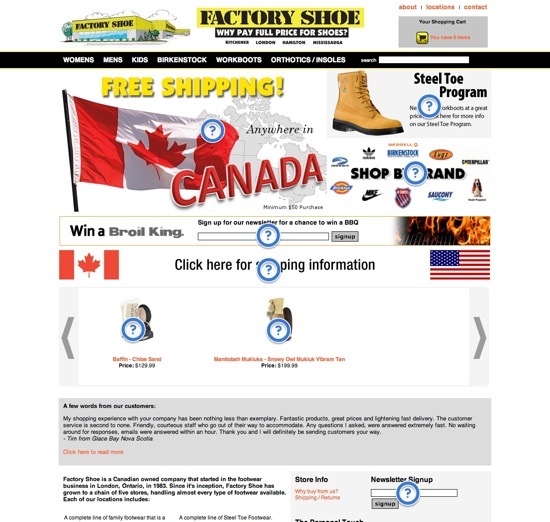
For our not-so-great user experience example, check out the Factory Shoe website:

The first thing I thought when I landed on this page was "FREE SHIPPING," and then...well, I briefly thought about a lot of things. Remember, I'm looking to buy a pair of boots, and presumably, the goal of Factory Shoe's website is to sell me a pair of boots. We should be a perfect match, and I should be thinking about one thing, but unfortunately, there is far too much clutter on this page and definitely no clear call to action. In fact, I thought many things when I arrived on this page, but not many of them involved boots. I know they have free shipping to anywhere in Canada (but that they also ship to the US), that they have a steel toe program, that they sell some cool brands, that they seem to want me to sign up for their newsletter more than they want me to buy boots (which I don't like), that I can win a BBQ on a boots website, and that the American flag is almost catching fire.
So as you can see, there's a lot of commotion on this homepage (which isn't good). Not including the navigation bar, I highlighted eight different areas that compete for my attention, and again, many of them aren't about boots. My best bet for poking around Factory Shoe's website is the navigation bar, which means they've wasted the entire area of their homepage by failing to connect me with the reason I'm visiting them and the reason they exist. In many cases, a visitor like me will click in, see the cluttered and unorganized page, and revert back to their Google search to try another website.
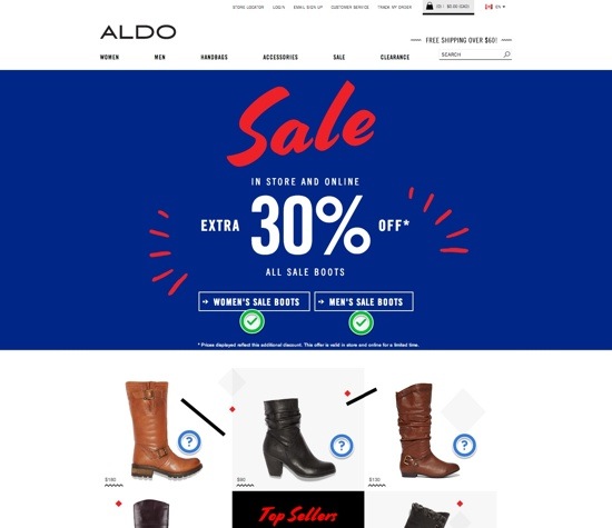
Now that I've gone back to the search engine results page and selected another site, let's take a look at a much better example: Aldo Shoes:

Well, then, that's significantly better. I immediately thought, "Wow, they have a big 30% off sale. I'm a woman, I like boots that are 30% off, let's do this." And then I clicked through to precisely where Aldo wanted me to click, which means within three seconds, I was exactly where they wanted me to be. I haven't converted yet, but I'm looking at a page of boots that are all 30% off, so they've moved me along the conversion funnel very quickly.
With the way this page is set up, Aldo clearly wants visitors to buy a pair of boots that are 30% off. Since I would like to buy a pair of boots, the only real choice they've given me is to determine whether I'd like to look at boots for men or boots for women (which is reasonable since both men and women need boots). Sure, there's the navigation bar (which I can use if, say, I'm looking for some shoes instead of boots) or the top sellers section, where I can immediately click through to purchase a popular pair of boots. But let's be serious, the vast majority of visitors are going to do exactly what Aldo wants, and that's click through to the sale. It really can be that simple.
The Impact of a Higher Conversion Rate
Just so that these hypothetical numbers are easier to digest, let's assume that the traffic-driving efforts (SEO, PPC, content marketing) of Factory Shoe and Aldo are fairly equal, and each site generates 20,000 new visitors a month. Let's also say that the average value of one customer conversion to both companies is $50 profit per sale. The only difference between the two sites, as outlined above, is their conversion rates. Aldo's is going to be better (5%) than Factory Shoe (3%); in reality, Aldo's is probably better by more than 2%, but just to show how significant the conversion rate is, we'll keep them pretty close.
With 20,000 visitors a month, a 5% conversion rate, and a $50 customer value, Aldo would generate $50,000 profit per month from online sales with these numbers. That's $600,000 per year.
With 20,000 visitors a month, a 3% conversion rate, and a $50 customer value, Factory Shoe would generate $30,000 profit per month from online sales with these numbers. That's $360,000 per year.
The only hypothetical number that really matters here is the conversion rate percentage because it highlights just how significantly website conversion can impact your business's bottom line. With everything else being equal, Aldo's profit from online sales is nearly double that of Factory Shoe—all due to the 2% conversion rate margin. In this simple example, 2% makes a $240,000 difference over the course of a year.
What Can You Do To Increase Website Conversion Rate?
It sounds like magic, so now you want in. It's not magic, but just a little bit of work and focus in the correct areas can make a huge difference almost immediately.
Here are some things you can do to improve website conversion:
Assess Your Website: review the Aldo/Factory Shoe example a second time and then try to objectively assess your own website and its user experience. Does your website remind you of Aldo or Factory Shoe? Do you think visitors are immediately aware of what you want them to do, or are they likely confused? Be honest, and don't get discouraged if you realize your website might be more like Factory Shoes than Aldo's - you can always do something about it. Often, you can make some minor graphical changes and move content around, and before you know it, your homepage will be much less cluttered. Even a 0.5% increase in conversion makes a huge impact.
Work on Conversion Design: determine whether your website's design matches its purpose. It's important that every aspect of your site works cohesively and is designed for optimal conversion.
Use Landing Pages: regardless of whether you're using landing pages, your homepage should be clean, organized, and concise. However, one of the best ways to further improve your website conversion is to use landing pages for different groups of incoming visitors. So, instead of sending both your PPC traffic for "men's boots" and your social media contest traffic to your homepage, you have unique URLs for each of these groups and can really get your pages laser-focused on a singular and targeted call to action.
What is a good website conversion rate? An average industry conversion rate is between 2% and 5%. However, this will depend on your goals and other factors.
About the Website Conversion Funnel
Have you ever wondered what happens after someone clicks on your website link? What path do they take, and how can you influence their decisions? The answer lies within the website conversion funnel, a strategic framework that maps the visitor's journey toward a desired action.
Visualize a funnel with a wide mouth at the top and a narrow exit point at the bottom. The wide top represents the vast pool of potential visitors who arrive at your site, perhaps through search engines, social media, or direct referrals. As they navigate your website, some will drop off at various stages, while others will progress further down the funnel, inching closer to conversion.
The conversion funnel is typically divided into four key stages:
- Awareness: This is where visitors first encounter your brand. They might be browsing the internet, searching for solutions to problems, or simply clicking on an interesting ad. Your goal here is to grab their attention and introduce your brand as a potential answer to their needs.
- Interest: Once aware of your brand, visitors become intrigued. Engaging content, informative product descriptions, and persuasive calls to action (CTAs) can pique their interest and nudge them further down the funnel.
- Desire: Now, visitors are actively considering your offering. Social proof elements like testimonials, customer reviews, and case studies can build trust and convince them your product or service is the best solution.
- Action: This is the ultimate goal of the funnel. Here, visitors take a desired action, such as making a purchase, subscribing to a newsletter, or downloading a white paper. A clear and streamlined checkout process or a compelling signup form are crucial at this stage.
This post should help you understand the power of website conversion, but as always, if you need help or are struggling to get started, don't be shy to contact a digital marketing expert!


