Key Highlights
By reading this article, you’ll learn:
- What UX means in eCommerce and why it matters
- How to create a website that feels fast, clear, and trustworthy
- Which design choices improve user flow and reduce cart abandonment
- Real examples of eCommerce sites with excellent UX
- How AI is changing the way websites respond to user behavior
Your eCommerce site should feel simple and trustworthy from the first click. Online shoppers won’t waste time on pages that load slowly or layouts that confuse them. If they can’t find the detailed product info they need or don’t feel safe entering their payment methods, they’ll leave.
A great user experience keeps people on your site longer and makes it easier for them to buy. Clear navigation on your website, fast performance, and visible contact details help build trust and remove friction. Knowing how to improve user experience on an eCommerce website can lead to more sales and fewer abandoned carts.
| Most shoppers decide whether to stay or leave your site within seconds. A clean layout and visible trust signals make those seconds count. |
What is UX in eCommerce?
UX in eCommerce means user experience. It’s the overall quality of a customer’s interaction with your online store.
It includes:
- How fast does your website load
- How easy it is to find products
- How simple the checkout process feels
- How safe and trustworthy your site appears
- How well your site works on mobile devices
When the experience is smooth, shoppers stay longer and are more likely to buy. If it’s slow or confusing, they leave. Good UX removes barriers. It makes shopping feel easy and reliable.
What Contributes to a Positive UX?
A positive UX comes from a website that feels fast, simple, and trustworthy. In eCommerce, this means removing anything that slows people down or makes them question your business. Key factors include:
- Clear navigation
Menus should be easy to find and understand. Visitors should know where to click next without guessing. - Fast load times
Pages should load in under three seconds. Speed keeps people engaged and reduces drop-off. - Mobile-friendly design
Most shoppers use phones. Your site should work well on all screen sizes with buttons that are easy to tap. - Accurate search and filters
Let people sort and search by what matters to them, like price, size, or availability. - Trust signals
Display contact info, reviews, payment icons, and security badges to make people feel safe. - Simple checkout process
Fewer steps mean fewer chances to abandon the cart. Offer guest checkout and multiple payment options. - Helpful product pages
Use clear photos, short descriptions, prices, and shipping info. Make it easy to decide and buy.
Why is UX Important for eCommerce Websites?

UX is important for eCommerce websites because it directly affects whether people buy from you or leave. If your site is hard to use, slow, or confusing, shoppers will go somewhere else.
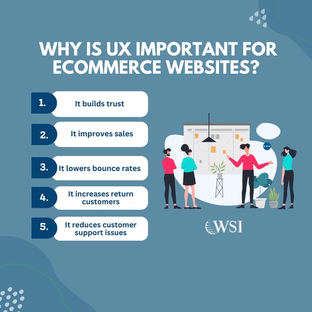
Here’s why UX matters:
It builds trust:
A clear, well-organized site with visible contact details and security signs helps people feel safe.
It improves sales:
When users can find products easily and check out without trouble, they’re more likely to complete a purchase.
It lowers bounce rates:
Good UX keeps people on your site longer, which can also help with SEO.
It increases return customers:
A smooth, reliable shopping experience makes people more likely to come back.
It reduces customer support issues:
If your site answers questions and works properly, you’ll get fewer complaints and support requests.
Examples of eCommerce Websites with Great UX
Apple
Apple’s site is clean, minimal, and intuitive. The navigation is clear, product pages let images take center stage, and the checkout flow is simple and predictable.
Nike
Nike combines bold visuals with smart filtering, personalized recommendations, and storytelling. The site feels premium without being complicated.
ASOS
ASOS offers excellent product filtering, size guides, user reviews, and fast search. The site works smoothly across devices.
Allbirds
Allbirds uses muted color palettes, whitespace, and clear calls to action. The product is the star. It’s visually soothing but also conversion-focused.
Etsy
On Etsy, product pages are rich with customer info: ratings, delivery estimates, seller profiles. It balances discovery (browse) with clarity (buy).
Sephora
Sephora blends content and commerce: tutorials, reviews, user photos, and product details all live in one place. Shoppers feel informed, not pressured.
Luxury / Brand‑Driven Sites (e.g., Totême, Byredo)
These brands focus heavily on brand story, premium visuals, and subtle UX cues. Their sites often lead with lifestyle imagery and secondary navigation that feels intuitive.
Bonnie Plants
A more niche example: Bonnie Plants’ product pages include clear specs, nice visuals, and contextual help so gardeners know exactly what to expect.
3 Best Practices for UX Design in eCommerce
Ecommerce Website Experience #1 – Learn
Exactly as IRL, prospects will ask themselves, “Does this look right?” and “Am I comfortable doing business with this company?”. Use your Home, About, and Why Buy from Us pages to portray the type of establishment you are. Include social proof content, such as testimonials and how-to articles, to engage and build your reputation as a helpful expert. Display your physical phone number in the header, as it is still a subconscious trust indicator. 51% of consumers trust companies that make it easy for visitors to contact the company's people.
Use your website's footer to build more legitimacy with certifications, security protocols, and professional partnerships. One-fifth of shoppers have abandoned a purchase because they don’t trust the website's security.
Double down on your contact details and make navigation easy with the predictable social media links in the footer.
Thanks to Amazon and eBay, a well-curated search function is essential on your Home page. While the element's arrangement can vary, category image navigation helps move customers to your profitable, key product categories. This is particularly important as the public gets more comfortable with using mobile to shop. By 2025, 75% of all retail eCommerce worldwide is expected to be on mobile. At the same time, beware of distracting carousels and animations, which can negatively impact your conversion rate.
Make checking out easy – just as you would in a physical store.
Ecommerce Website Experience #2 – Shop
Your product catalog pages and how you categorize them to assist in navigation tell users that you have the solutions they are searching for. Your website is your shop, so who is your best sales assistant? A dynamic search with multiple different filters that helps your customer find what they want.
People make decisions based on comparisons, so help them compare options. Answering questions before they are asked keeps customers moving through the flow to making a purchase – avoid instances where they may stop and wonder “why?” as this is when you risk losing them.
Customization options, such as choosing a specific color combination, mean that the user is investing more time selecting that product. Feeling control in the experience leads to more commitment, and that, in turn, leads to significantly improved conversion rates.
Your images must be of the best quality possible, without impacting your page performance. In line with that, videos are growing more popular every day – especially for your top, high-markup products. 82% of shoppers say that watching a video influenced their decision to purchase.
Make everything easy for your customers – from navigation and checkout to descriptions and warranties.
Ecommerce Website Experience #3 – Buy
To complete the purchase process, your checkout page needs to be as clear and concise as possible. Avoid being part of the approximate 70% global cart abandonment rate for eCommerce by:
- Removing all possible distractions;
- Having a one-page checkout process;
- Avoiding forced registration and allowing guest checkout;
- Waiting to upsell until the purchase is complete.
- Offering multiple payment options, like a credit card, PayPal, or Apple Pay;
- Being open about shipping costs right from the beginning.
UX eCommerce Trends

1. Hyper‑personalization & AI‑driven experience
Users expect your site to adapt to them. Using data and AI, stores can rearrange content, recommend products, or tailor offers based on browsing behavior.
“Context‑aware interfaces” and “anticipating user intent” are becoming standard.
2. Mobile UX is nonnegotiable
Mobile is the primary device for many shoppers. But many sites are still underperforming there.
Expect more focus on mobile navigation, tap targets, efficient filtering, and optimizing image sizes for mobile devices.
3. Micro‑animations & meaningful motion
Subtle animations help guide the user without being distracting. Hover effects, button transitions, or scroll cues can make the experience feel alive.
The key is restraint; animation must serve function, not just flair.
4. 3D, AR, & immersive interfaces
More sites are introducing 3D models or integrating augmented reality so users can “see” how a product fits in their space.
For example, a furniture store could let shoppers use AR to place a chair in their living room through their phone.
5. Voice & conversational commerce
Voice search, chat assistants, and conversational UIs are growing. Shoppers want to ask questions with their voice or chat and get instant results.
Your UX needs to support that, better voice‑search indexing, clear verbal cues, and all-back text navigation.
6. Composable & headless architectures
To keep UX flexible and scalable, more brands use headless or composable commerce setups. That lets you change front-end UX without reworking back-end systems.
You can deliver custom, dynamic experiences while keeping the core commerce logic stable.
7. Clarity, speed, minimal friction
Users in 2025 are intolerant of confusion, delays, and unnecessary steps.
Microcopy (labels, helper text), instant feedback, and responsive UI elements are essential.
8. Data privacy, transparency & trust signals
As AI and data use grow, consumers will demand more clarity about how you use their data.
Security badges, explicit consent flows, and clear privacy notices will play a bigger role in UX.
9. Diverse & smarter search autocomplete
Autocomplete must avoid repetitive suggestions. A new trend is to “de‑boost” semantically similar query suggestions so the list is more varied and useful.
This reduces user friction and helps people explore more relevant results faster.
AI and Website UX: What’s Changing and Why It Matters
1. AI-Powered Personalization
AI can customize your site experience to each visitor. It can:
- Recommend products based on browsing history
- Adjust homepage banners depending on location or behavior
- Show content or offers that match user intent
Why it matters: Personalization improves engagement and conversion. Shoppers feel like the site “gets” them without needing to sign in or search hard.
2. AI-Enhanced Search and Navigation
Smart search tools now use AI to:
- Understand natural language
- Correct typos
- Predict intent
- Suggest related or popular queries
Why it matters: If users find what they want faster, they’re more likely to buy or engage. It also reduces bounce rates and frustration.
3. Conversational Interfaces and AI Chatbots
Modern chatbots do more than answer FAQs. AI can:
- Help users find products or services
- Walk users through the buying process
- Handle support questions 24/7
Why it matters: Fast, accurate answers reduce drop-offs and build trust. Users expect instant help, and AI makes that scalable.
4. AI-Based UX Testing and Optimization
AI tools now monitor real user behavior and suggest UX changes. Some tools:
- Track rage clicks or user hesitation
- Test design variations automatically
- Recommend layout changes to reduce friction
Why it matters: You can improve your UX faster without waiting for a full redesign or manual analysis.
5. Accessibility and AI
AI helps identify and fix UX problems for users with disabilities. For example:
- Auto-generating alt text
- Adjusting color contrast
- Offering voice navigation support
Why it matters: Accessibility is required by law in many regions, but it also makes your site usable for more people.
| Artificial intelligence now helps eCommerce stores personalize experiences, predict intent, and improve user journeys faster than ever. |
Improve Your eCommerce User Experience with WSI

With the assistance of your local WSI consultant, you can tweak your eCommerce web design and see the impact of those changes using analytics. But don’t focus solely on the design, and make sure to spend as much time as possible on the entire online shopping experience.
For more information on improving your e-commerce website experience and other digital marketing strategies, talk to us today.
FAQs about eCommerce UX#1. What does UX mean in eCommerce? UX stands for user experience. In eCommerce, it refers to how easy, fast, and clear it is for someone to use your website, from browsing to checkout. #2. Why is UX so important for online stores? Good UX builds trust and makes it easier for people to buy. Poor UX causes confusion and leads to lost sales. It affects everything from your conversion rate to your customer loyalty. #3. What are some signs of bad UX?
#4. How can I improve UX on my eCommerce site?
#5. What tools can help measure UX? You can use:
#6. How does UX affect SEO? Better UX means longer visits and lower bounce rates, which can help search rankings. Google also rewards mobile-friendly, fast-loading sites. #7. Should I design for mobile or desktop first? If you’re wondering how to improve user experience on an eCommerce website, you should design for mobile first. Most online shopping now happens on phones. Your mobile site should be just as fast and easy to use as your desktop version. |


