When it comes to landing pages, the numbers are skewed. Landing pages do a staggeringly effective job at converting site visitors into paying customers. But directing customers to standalone landing pages is an underused tactic. If you want to improve your landing pages, implementing this strategy will give you a significant edge over your competitors.
We've touched on this concept before: When the numbers don't add up, it means there's an opportunity for businesses. Even though landing pages are slowly becoming the standard, implementing them now will still give you a significant edge over at least a few competitors. Leveling up your landing pages can improve your conversion rate, which impacts your bottom line. And the best part? You can do it without increasing the number of visitors to your site.
To give businesses an idea of how much of a difference landing pages can make, we found some stats highlighting Why You Need To Level Up Your Landing Pages.
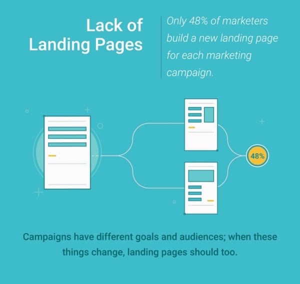
Since you're looking for information on landing pages, you've probably heard that using a homepage as a landing page is a bad idea. Unfortunately, most businesses take this to mean they can create one landing page – a home landing page – as a catchall for every campaign they're running. In fact, 52% of marketers (for shame!) don't even create a new landing page for different marketing campaigns.
In the same way, it's suboptimal to send every single site visitor to your homepage, it's a mistake to send email subscribers, social media followers and PPC traffic to the same landing page. Each channel has unique methods for getting visitors to click through and different promises and goals once they do – so why would you send them to the same generic page?
What is Landing Page Optimization?
Landing page optimization is the process of improving the design, content, and functionality of a landing page to increase its effectiveness in converting visitors into customers or leads. The primary goal is to ensure that the landing page drives the desired action, whether completing a form, making a purchase, signing up for a newsletter, or any other targeted outcome.
Landing page optimization aims to improve the conversion rate and the percentage of visitors who take the desired action. This process often involves continual testing, analysis, and refinement to achieve the best results.
Key Elements of a High-Converting Landing Page
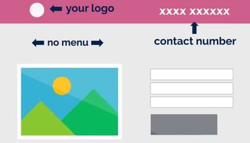
A high-converting landing page combines clarity, compelling design, and a user-focused approach to maximize conversions. The essential elements include a captivating headline that grabs attention and communicates the main benefit of your offer. A strong value proposition answers the critical question, “What’s in it for me?” by highlighting the unique benefits and solving the visitor’s problem. Persuasive and visually distinct calls-to-action (CTAs) drive users toward the desired action, while minimal distractions, like reduced navigation and streamlined layouts, keep them focused. Trust signals such as testimonials, badges, or real-time proof establish credibility, and mobile-responsive landing pages ensure a seamless user experience.
Landing Page Optimization Best Practices
Effective landing page optimization ensures visitors have a seamless experience, driving more conversions and improving campaign performance. Here are the best practices to follow:
Target the right audience
To ensure your landing page drives conversions, targeting the right audience from the outset is crucial. Start by understanding the specific needs, preferences, and pain points of the individuals you want to reach. Use market research, customer personas, and data-driven insights to tailor your messaging, design, and offers to this audience. The content and visuals on your landing page should speak directly to the problems your audience is facing, making it clear how your product or service can solve those issues. By focusing on the right audience, you can create a more personalized experience that resonates with visitors, increasing the chances that they will take action. A clear understanding of your audience ensures that your landing page elements are aligned with their expectations, boosting engagement and improving your landing page conversion rate.
Create unique landing pages for each stream
Start embracing the power of landing pages by creating specific pages for your various traffic streams. Landing pages must align closely with user intent, ensuring they speak to what visitors expect. It won't be long before you experience more success and higher conversion rates!
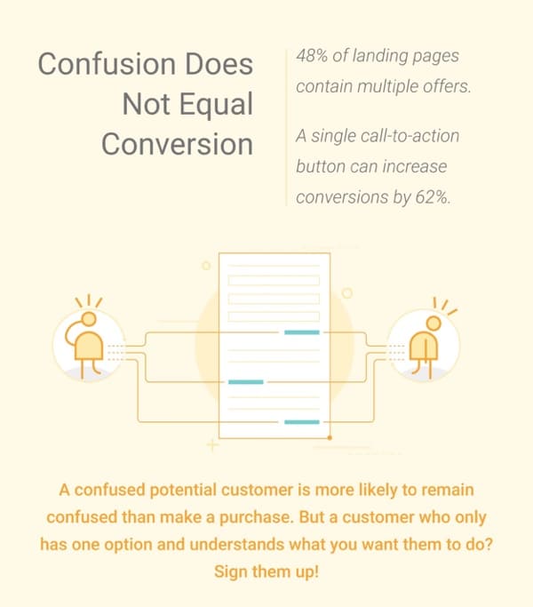
The maxim "less is more" applies to many things – landing pages included. However, the fact that 48% of landing pages contain multiple offers suggests that most businesses haven't yet made the connection. The temptation to cram more than one offer onto the page where you know visitors land is strong – but don't do it. Customers don't want to be confused or oversold, and offering something other than exactly what they're expecting actually does both. Craft strong, confident offers and trust your landing pages to do their work! Oh, and don't forget to include a call to action, as a single call-to-action button can increase conversions by 62%. Personalized call-to-actions on landing pages improve performance by 202%.
Choose Your Landing Page Message
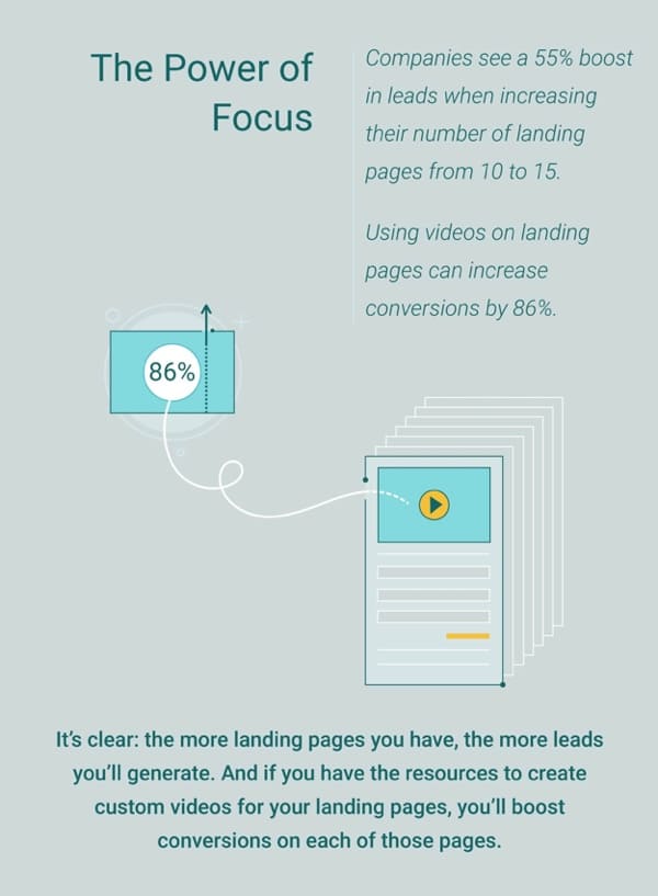
If you have a couple of landing pages and aren't getting the results you want, don't give up quite yet. As we've discussed, the more you connect the messaging of your landing page to the arriving audience (and the channel they used), the better results you'll get. If this means creating more landing pages – even different ones for segments of the same audience group – then do it (the stats have your back).
If all else fails, add short explainer videos to your landing pages. Using videos on landing pages can increase conversions by 86% – anything capable of producing results that good are worth a shot!
Test Your Landing Page Design
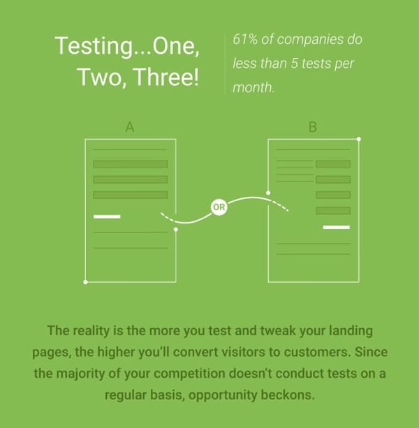
One of the biggest factors that stunt the success of marketing campaigns is not testing vital components like landing pages! The fact is that landing pages are where the magic has to happen, so you need to be sure that every aspect of the page is contributing to conversion! You've spent the money and dedicated time to funnel visitors to a certain page with an exact message, but then you don't test to ensure the headline or call-to-action button isn't confusing customers.
61% of customers do less than five tests per month on their landing pages; excuse me for saying it again, but this is an opportunity! Test your landing page components, tweak them based on your findings, and enjoy the increased conversions with just a little extra work.
Page Layout and Form Fields Matter
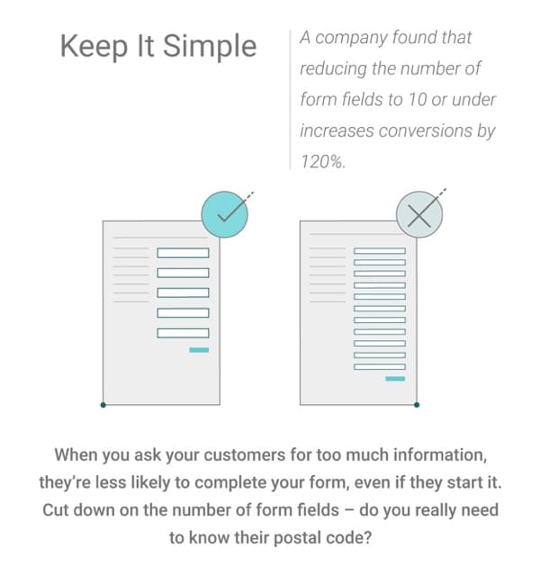
Last but not least, we have come to a pretty straightforward fix for an all-too-common landing page mistake: there are too many form fields. Yes, we live in the Information Age, which means every little detail you can pull from your potential customers can be used to your advantage. But you know what? One or two pieces of information are a lot better than zero, which is what you'll get if you present customers with a 15-field form!
The proof is in the pudding: a company found that reducing the number of form fields to 10 or under increased conversions by 120%. I'll go further and suggest you keep the number of form fields to less than five, as I firmly believe in keeping things as simple as possible.
How Can AI Be Used to Personalize Landing Page Content?
AI can significantly improve landing page optimization by personalizing content based on user behavior and preferences. For example, AI can tailor the landing page copy to individual visitors using browsing history or geographic location data, ensuring that the content resonates with their specific needs. It can also adjust landing page content in real time, displaying relevant offers or products based on what the user has shown interest in. AI-powered A/B testing can optimize the layout and elements on your landing page, like headlines or CTAs, ensuring that the page performs better across different user segments. Additionally, AI can personalize thank-you pages by showing follow-up offers or content relevant to the user’s journey, increasing the likelihood of future conversions. By tracking user behavior on your landing page, AI can continuously improve the landing page experience and adapt it to different audience segments, ensuring a more engaging and practical experience.
Contact Us and Get Started with Landing Page Optimization
At WSI, we specialize in helping businesses improve their landing pages to maximize conversion rates and drive more value from their digital marketing efforts. Whether you're looking to create a landing page from scratch or optimize an existing one, our team can guide you through every step of the process. We focus on landing page best practices, ensuring your page performs well and delivers the expected results. From optimizing your CTA to enhancing page speed and incorporating social proof, we provide a comprehensive landing page optimization guide customized to your unique needs. Contact us today to help improve your landing pages for better results.


