One of the toughest aspects of digital marketing, for both marketers and companies, is keeping up with how fast it changes. Just think about it: if it's possible for busy marketing teams to fall behind and miss things because they're immersed in their day-to-day activities, imagine how tough it is for people outside of the industry?
We sympathize with you guys, we really do, but that doesn't mean we're going to stop harping on the importance of battling through the time constraints to stay on top of the ebbs and flows of digital marketing. More than any one tactic or strategy, keeping pace with digital trends, rules, and best practices will be the driving force behind successful, long-term marketing campaigns.
The Internet is an aesthetic place where graphics, images, and video play a large role in the stories both people and companies tell. But as web design becomes more accessible to the masses, it changes at a quicker pace.
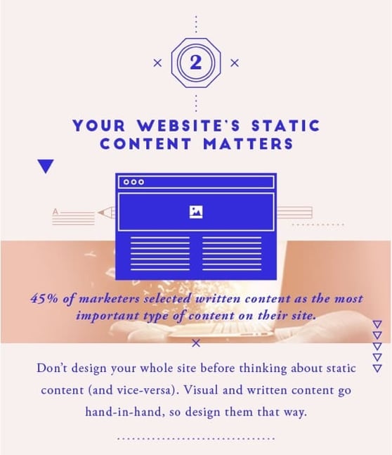
As we head further into 2016, we thought it'd be a good idea to take a deep dive into the world of web design to determine the biggest shifts in conventional practices. So here is the Web Design Stats You Can’t Ignore in 2016:
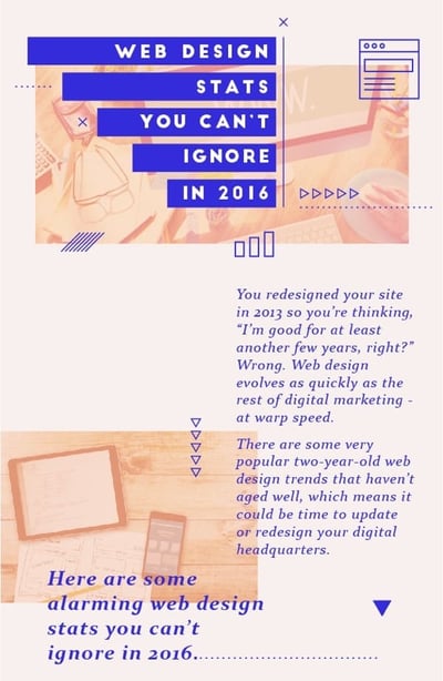
Time flies. Whether it's getting older or watching the weekend disappear before you've even enjoyed it, the ways in which we perceive the passage of time are fascinating. So even though it feels like you redesigned your website last year, it was probably more like three years ago. And, as we keep saying, a lot can happen in three years. Don't be satisfied with a website that's boring and dated because one thing is for sure: your customers won't be.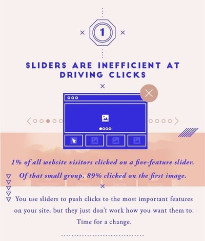
The stats on the effectiveness of website sliders (also called carousels) are astounding: in a study, only 1% of visitors clicked on a slider image. The reason this is so shocking is the sheer amount of websites that are built specifically around sliders (yes, including ours). The purpose of a slider is for users to click and navigate through the images, but the data says they just don't work that way.
Why then, do so many websites still have sliders? For starters, since sliders are often a central design feature, it's hard to move away from them without a complete redesign. But given the metrics, and the fact that visitors are using sites in completely different ways than these designs intended, it's time to implement more useful design features.
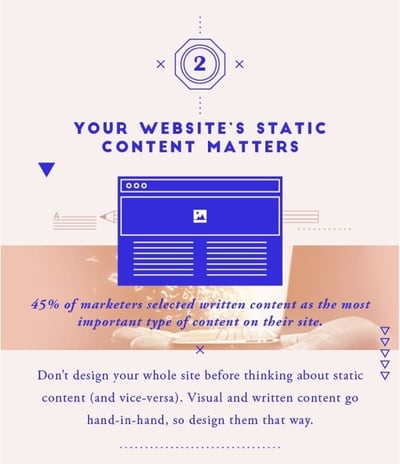
You've seen (and likely used) the "Ipsum lorem ipsum" example text, but there are a couple of reasons you should stop using placeholder content. The biggest reason is that content isn't just an afterthought, so it shouldn't be treated that way. In a recent poll, 45% of marketers said written content is the most important type of content on their site. But my question is, how many of those same marketers used example text when they designed their website? Too many.
Design and write your website and its content side-by-side, in real-time. You'll get the content right, which will help you get the design right and in the end, you'll produce a great website with fantastic content.
You can spot stock images a mile away. And while their obviousness doesn't render stock images completely useless, they certainly don't move the needle as much as custom-made images do. And the thing is, they don't have to be hand-sketched, super professional images to be "custom."
With graphic tools like Canva, even those of us with minimal design skills can create decent custom images. What's more, anybody with a camera can create customer imagery, too. In fact, 46% of marketers say custom photography will be part of their marketing strategy in 2016.
Do yourself a favor and phase out stock images, or at least dress them up a little bit; it's worth the extra effort, and potential customers will notice.
"I don't have time." We all say this, probably more than we should, but that's a discussion for another day. Nevertheless, this mantra of not having enough time in our days has certainly transferred over to our Internet usage. Internet users have no patience whatsoever, so heavy pages that slow people down are an absolute disaster for your marketing campaigns and websites.
In a recent article, Econsultancy found that 40% of people will abandon a web page if it takes more than three seconds to load. In the grand scheme of things, three seconds doesn't sound like much, but it's a hard fact that it'll cost you conversions and ultimately, dollars from your bottom line. Get rid of those sliders, scripts, and anything else weighing your pages down.
It used to be that merely having a website, fresh content and an active social media presence was enough to help your business stand out from the crowd. But that's obviously no longer the case as these things are now a standard expectation. The key to differentiating your digital presence is finding the perfect medley of marketing tactics. And in 2016, that means telling stories with visual content, as 65% of senior marketing execs believe that photos, videos, illustrations, and infographics will all be part of the stories their brands tell.
It might sound like a lot of work, but when it comes to something as important as the design of your digital presence, that's the price of doing business in 2016.
That's the end of our rundown of the latest edition of our monthly infographic, but be sure to check back next month for March's feature. Here's the full infographic, in case you want to share or blog about it:


