One of the wonders of email communication is most of us carry it with us everywhere we travel. Our inboxes are in our pockets, which means we can, and most often do, read our email messages while we're on the go.
As a society in 2016, we're busy people. Places to go, people to see, money to make – there never seems to be enough time in the day. Properly executed mobile-friendly email campaigns are such an effective time-saver for consumers that they've become the standard for email communication. For businesses and marketers, this means any emails that are not mobile-friendly are at risk of alienating what is likely a growing group of mobile readers.
If you think you might be making this mistake, don't worry, we've got you covered.

The underlying theme of this infographic and entire post is this stat: 75% of smartphone owners are likely to delete emails that are not easily read on a mobile device. Not glance at, not ignore and not just miss completely – delete. The action of deleting an email takes more time than simply ignoring it and, with time so limited, this action is fuelled by emotions like anger, distrust and disappointment. Plain and simple, people don't like communications that don't mesh with their technology.
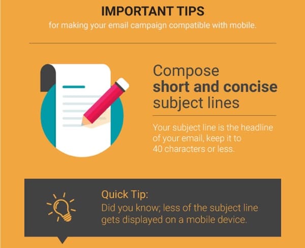
If you need proof of how fickle email marketing is, how about this: 33% of email recipients open email based on subject line alone. That's a lot of pressure on condensing your email down to one sentence, you know, so people actually click on it and read your full message. And oh did we mention, the average mobile screen can only fit 4-7 words max? If you aren't smart, concise and meaningful with your 4-7 word subject lines, mobile-readers won't pay attention to you.
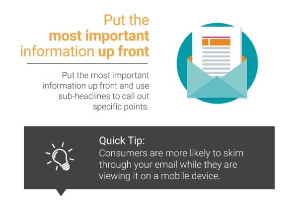
We've said it before – in our Digital Minds book, actually – but many people don't read on the Internet, they scan. And on a mobile device while riding a bus, train or a plane? Scan city. In any content written for the digital world, it's important that critical information gets top billing. Put important information in bold, highlight it, underline it – do anything you think it takes to appeal to people who merely scan your content.
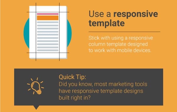
There is more than one way to optimize an email's display on a mobile device, but by far the easiest method is to use a responsive template for your campaigns. It's a simple, quick solution that allows you to focus more of your attention on your message and, as we've discussed, distilling the perfect subject line to represent your communication.
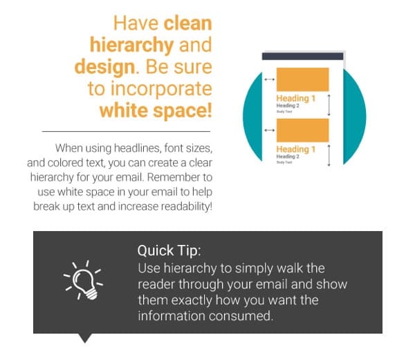
One of the most underrated components of great email design – and design in general – is effective incorporation of whitespace. When you use design to create a hierarchy, it helps your mobile readers focus and engage with your content while they're on the move and in the midst of distractions.
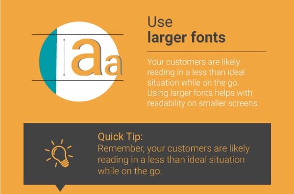
Sometimes it's the most obvious solutions that are the hardest to see. Are you ready for this one? Use smaller text for your email campaigns. While there's a good chance you craft your emails on a desktop, phones and tablets are have a much smaller screen. Couple the small screen with potentially dark, cramped and not to mention moving spaces and you have difficult reading conditions. Bigger font means less words on the screen, ultimately making your messages easier to read.
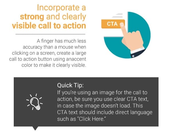
However hard you might work on a given email, there's always a chance something goes wrong. Let's say you use a creative image as your call to action but despite your best efforts it doesn't display for Safari users (doh!). If you went all or nothing with the image as your CTA, you're in for some rough results. However, if you backed up your image with a strong and direct call to action – like "Click Here" – you probably saved your bacon. And who doesn't like bacon?
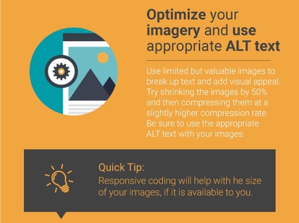
Everybody who markets in the digital world knows the importance of images and visualizations, but not everybody knows how to optimize them. Use great images, but also make sure to use ALT text and proper titles – that's your leg up on the competition.
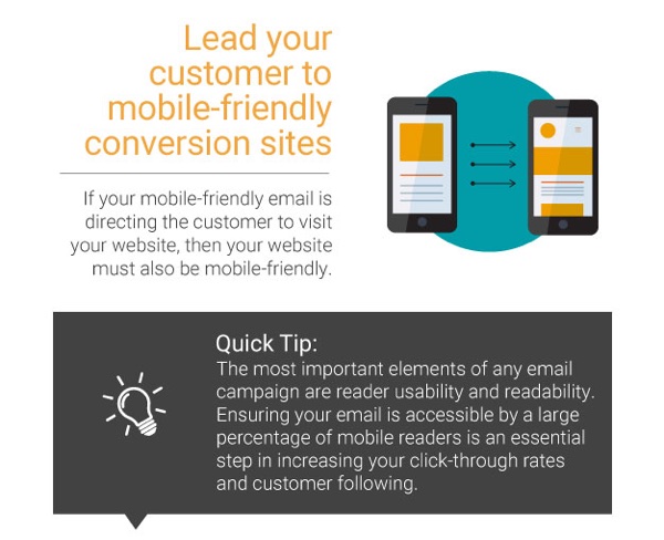
In digital marketing, consistency is one of the biggest keys to conversion. It's the reason why home pages don't make good landing pages for very specific ads, and it's also the reason mobile-friendly email campaigns should always direct potential customers to mobile-friendly pages. Sending mobile users to mobile-unfriendly pages is a surefire way to interrupt customers' purchase journey and lower your conversion rates.
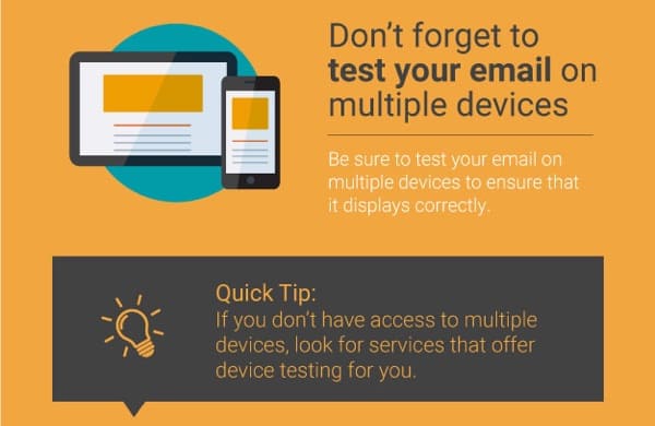
Testing, testing 1, 2, 3. Nobody uses a microphone without testing it first, right? Well emails need to be tested, too. As much as it would make sense for everyone to use the same Internet browser and have digital content display the same way, we aren't quite there yet. Testing your marketing messages on different browsers and device screens is, for the foreseeable future, still a very vital step in send mobile-friendly emails.
That’s all we've got for October's infographic summary, but come back in November to see what we come up with next. Here’s the full infographic, in all its beautiful glory:


